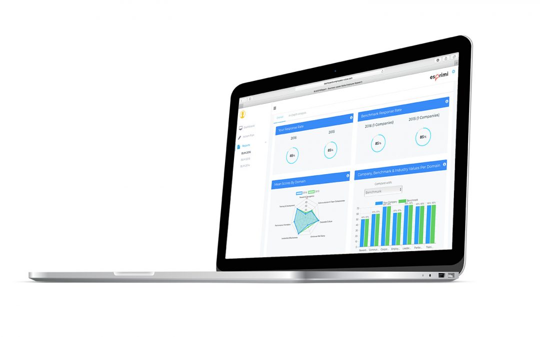
New Employee Insights dashbaord
We have launched a brand-new Employee Insights dashboard to transform the way users measure their employees’ engagement and satisfaction. The rethought and reworked dashboard encompasses a super clean and highly interactive user interface to make it easier for users to see and understand data and maximise impact.
Tracking and measuring the impact of employee engagement and satisfaction efforts in the workplace can be daunting and challenging for companies but with the right tool in hand, companies can navigate through stats and metrics with ease.
Our new Employee Insights dashboard has been reworked with this notion in mind – to help you stay in control of your employee engagement and satisfaction efforts by giving you visibility into your most important data, metrics and KPIs. So, let’s unpack some of the tools which feature in the brand-new dashboard:
1) New dashboard design
The new dashboard makes mining data easy thanks to its clean and highly visual and interactive interface. To do this, we’ve introduced more graphs and visuals to the dashboard and completely restructured the way in which information is presented. Dashboard information is now presented in a way that makes it straightforward and easy for the user to interpret results.
2) Introduction of an in-built year-on-year comparison table
Gone are the days of going through pdf reports to analyse your year-on-year efforts. Thanks to this new system, users can now view their year-on-year comparison table within the dashboard itself by jumping over to the In-Depth Analysis section located on the navigation menu at the top. But what does a 100% in-built digital table mean for our clients? It means that you can now flick through filters and hop from one section to the next flexibly and with incredible ease, all within a centralised environment.
3) Say goodbye to mean scores, and hello to percentages
Prior to the revamp, raw data collected contained satisfaction values based on Likert Scales on different scales which limited the possibility of seeing the different measured domains on an even playing field. To mitigate this issue, any mean scores obtained are now converted into easily interpretable and actionable percentages.
4) Real-time updates of benchmark results throughout fieldwork
Users can now benchmark their results with those of other participating companies as the fieldwork unfolds allowing professionals to spot emerging trends early and to take immediate action. But that’s not all! Once a decent sized sample has been collected, the new interactive dashboard will also allow companies to slice and dice their data across benchmark filters such as companies of similar size and companies in the same or similar industry. This way no stone is left unturned when it comes to drilling down to the metrics that really add value to your analysis.
5) Introduction of Employer Net Promoter Score (eNPS)
Users can now also keep score of the employability Net Promoter Score which is why we’ve dedicated a whole new section on the new dashboard to monitoring this variable. This new section is made up of two interactive graphs which display the eNPS on two dimensions – company-wide and per department. Not only does this new simplistic feature make assessing to what extent a respondent would recommend an employer incredibly easy, functional and interpretable – but together with other metrics, it also offers a united front and an all-round comprehensive view of the situation in your organisation.
6) New award score algorithm that tracks response rate-based performance
A high response rate is key to identifying levels of employee engagement and satisfaction and that is why we’ve introduced an all-new award score algorithm to the dashboard. The goal behind the new algorithm is to fine-tune the process of how award winners are ultimately determined. Besides performance related scores tied to the domains, the new award score algorithm also takes into consideration the response rate when determining the winner per company size category. The aim behind this new algorithm is to encourage all companies to strive for a strong and healthy response rate so that they can draw statistically significant solutions which allow them to optimise their engagement and satisfaction efforts fully.
This has been our biggest product update yet! We’re pretty proud of what we have developed and have no doubt that it will offer our users the very best of user experiences so far within the system. With that said, learning knows no boundaries so we will definitely continue to monitor user feedback and carry out updates and add new features and improvements across the platform as we go along. See the dashboard in action with our live demo. Visit www.esprimi.eu/employee-insights or get in touch on info@esprimi.eu to learn more.


